The First Scene I Notice

For me, movies often begin with the letters, not the story.
Watching Fonts Before Faces
Whenever I sit down to watch a film, my attention doesn’t go to the first line of dialogue or even the first shot. It goes to the typography. The way the letters appear on screen — their weight, movement, or even their restraint — sets a tone for me that lingers throughout the story.
Noticing the Tension in Psycho
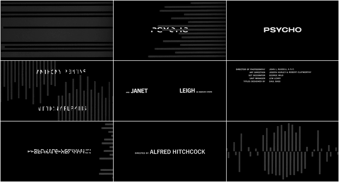
Take Hitchcock’s Psycho. Long before Norman Bates appears, the opening titles cut sharply across the screen, fragmented and jittering. It’s not over-designed, but it feels fractured and unsettling. Those letters already told me I wasn’t about to watch something calm. Typography here isn’t decoration — it’s mood.
The Quiet Unease of The Shining
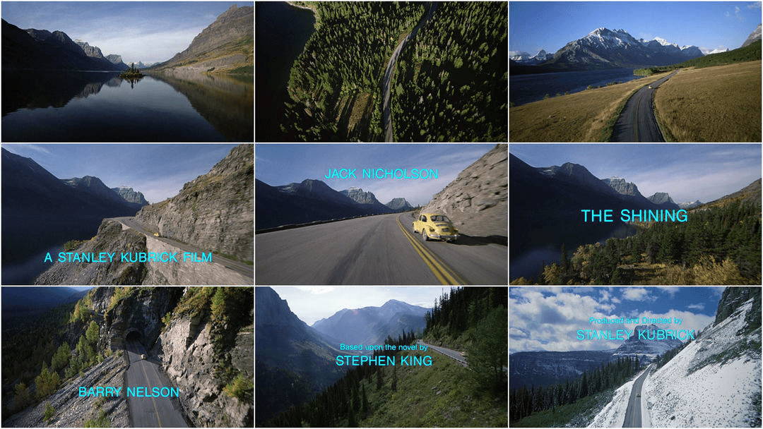
Kubrick’s The Shining makes the opposite move. Majestic landscapes roll by, with a single car winding toward the Overlook Hotel. And then — Helvetica. Plain, neutral, unembellished text. On paper, it looks almost boring. But in that moment, the neutrality is what disturbs me. The calmness feels wrong, amplifying the unease of those wide, empty spaces.
Typography as Part of the World
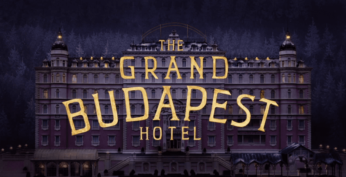
Wes Anderson takes typography into his worlds completely. The Grand Budapest Hotel’s ornate, pastel-colored letters feel like they belong on hotel stationery. Moonrise Kingdom’s handwritten style reads like a note passed between children. His fonts aren’t just credits; they’re props that shape how we enter his stories. Watching them, I feel like typography has been stitched into the fabric of his worlds.
Texture and Character in Letters
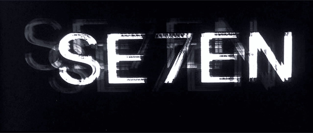
Some films give typography personality through texture. In Se7en, the credits flicker and scratch across the screen like they’ve been carved by hand. The imperfection makes the letters feel alive, almost human, and unsettlingly close. It’s messy but deliberate, and it sets the tone before the plot even starts.
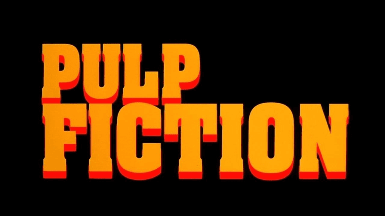
Then there’s Tarantino, who treats typography like a mixtape of cinema history. Pulp Fiction opens with bold yellow Franklin Gothic that screams pulp magazine. Kill Bill leans into grindhouse-style type, straight out of 70s exploitation posters. His fonts are more than style — they’re cultural references, fonts as time machines, pulling you instantly into the mood of another era.
Why I Always Watch the Letters
Over time, I’ve realized this habit changes how I watch films. Typography isn’t neutral — it can cut like Psycho, unsettle like The Shining, comfort like Wes Anderson, disturb like Se7en, or transport like Tarantino. It doesn’t just label; it sets the stage.
For most people, a movie begins with the story. For me, it begins with the letters. And I like it that way — because those small details remind me that design, even in its quietest form, can change the way we feel without us ever noticing why.
.see also
