Calculus Carbon
Redesigning the website experience with clarity, structure, and interaction in mind.
context
Calculus Carbon operates in climate finance, supporting institutional Nature-based Solutions (NbS) sponsors across the Global South. The website functions as a primary touchpoint for credibility, transactions, partnerships, and ongoing activity. With the brand identity already established, the redesign focused on improving structure, navigation, and interaction clarity to better surface core business information for an institutional audience.
approach
The approach began with understanding business context and stakeholder priorities, followed by identifying usability and clarity gaps across the existing experience. These insights informed decisions around information architecture, content hierarchy, and interactions. All changes were made within established brand constraints, with a focus on improving discoverability and clear communication of key information.
Design Constraints & Considerations
The redesign followed existing brand guidelines to maintain institutional trust while prioritising clarity for a credibility-driven audience. It addressed dense, information-heavy content and was designed to remain flexible for frequent updates as transactions, events, and partnerships evolved.

Baseline Usage Insights
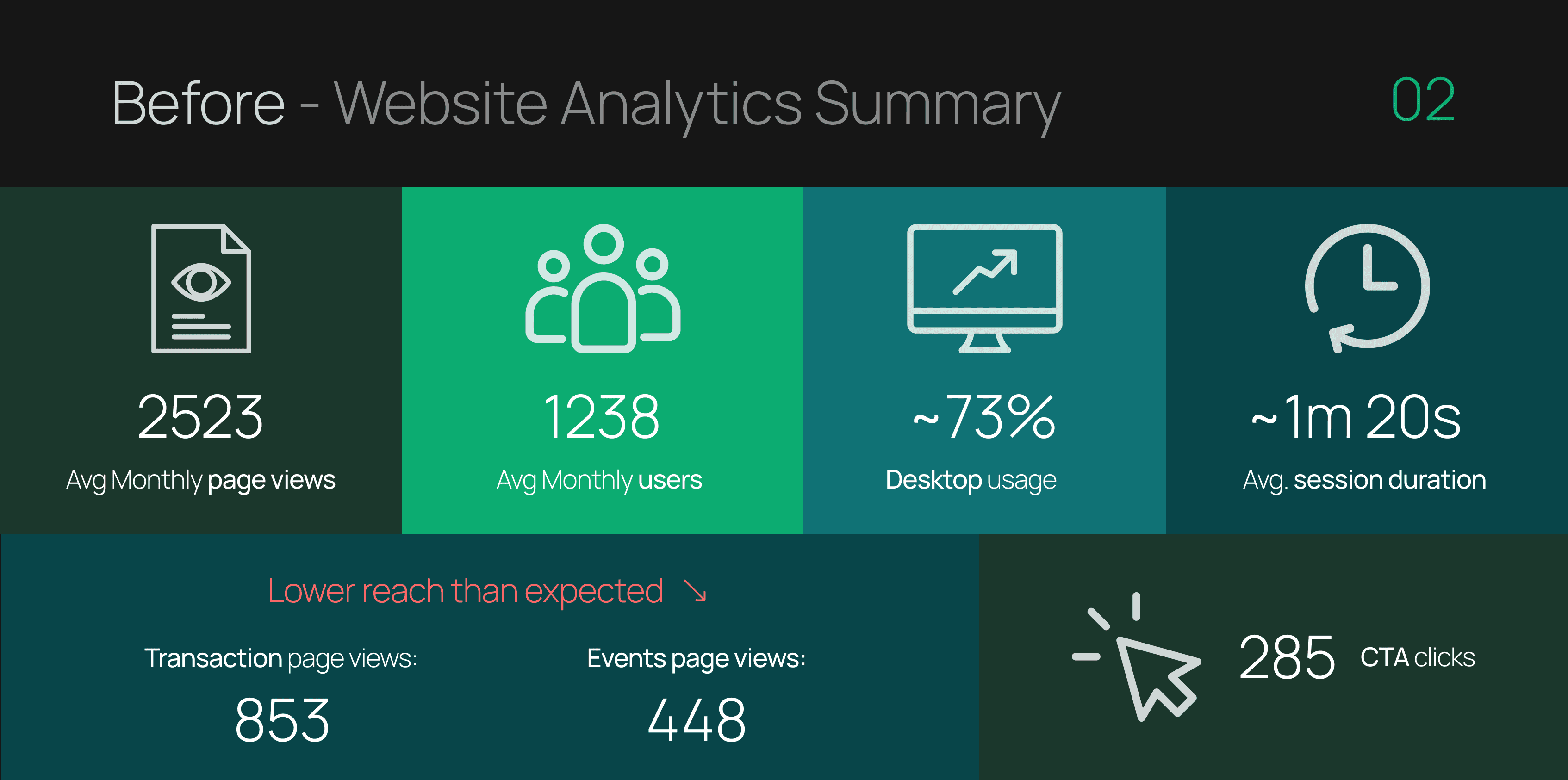
Initial usage signals showed low-volume but high-intent visits, with users mainly seeking credibility and core business information. Limited exploration beyond the homepage highlighted the need for clearer hierarchy and better visibility of key pages like transactions and events.
UX Audit (Heuristic Evaluation)
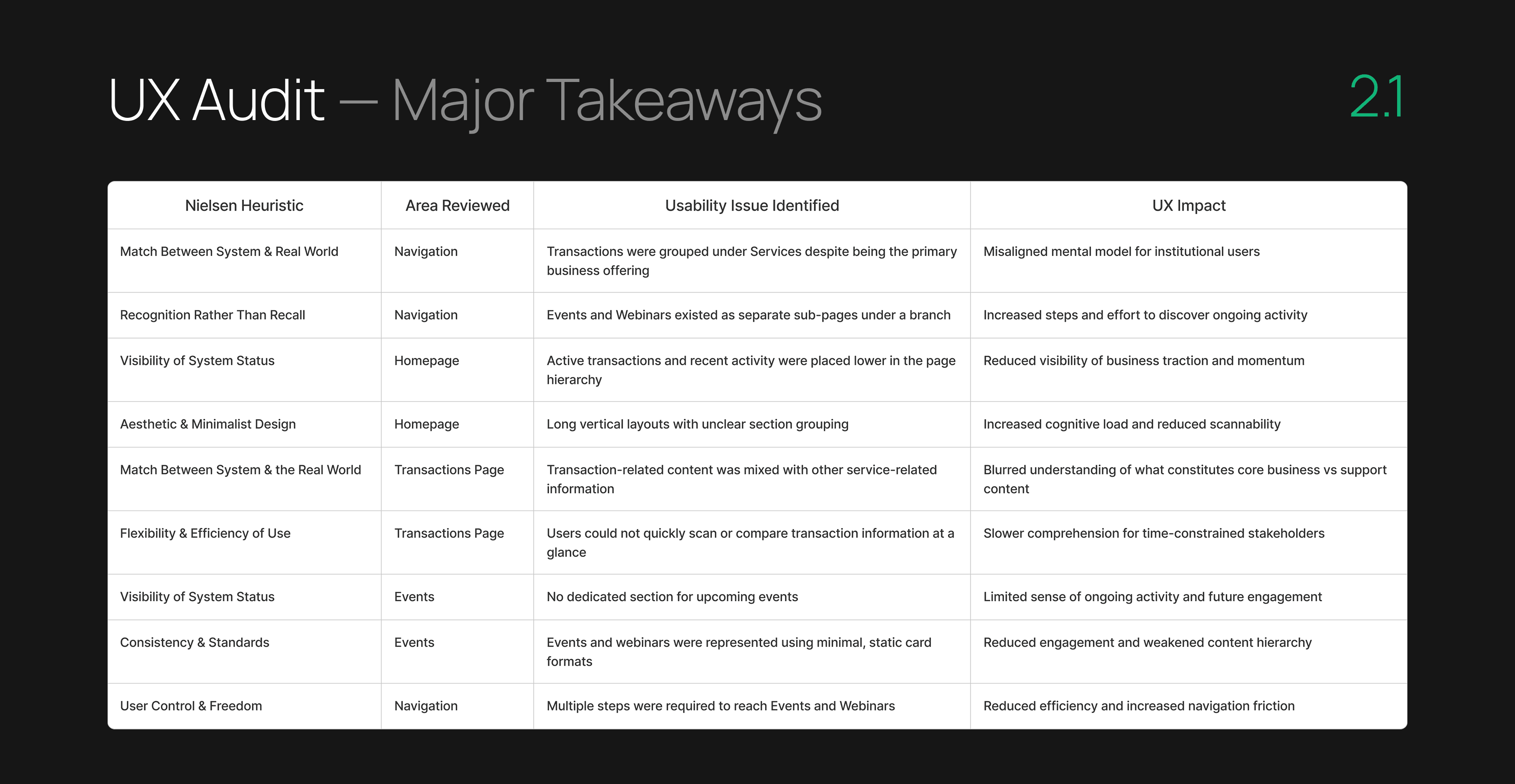
A heuristic review based on Nielsen’s principles was conducted to assess navigation, hierarchy, and content structure, helping identify clarity and discoverability issues across key business areas such as transactions and events.
Information Architecture Refinement
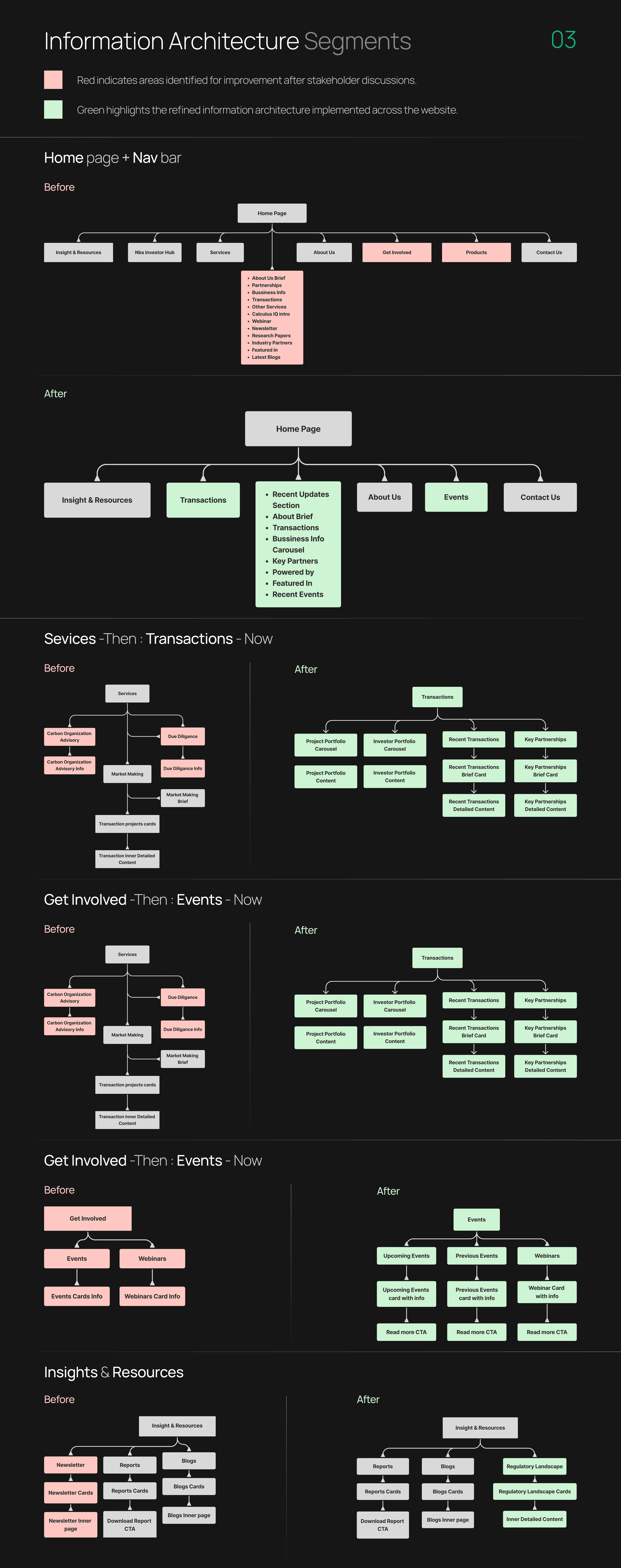
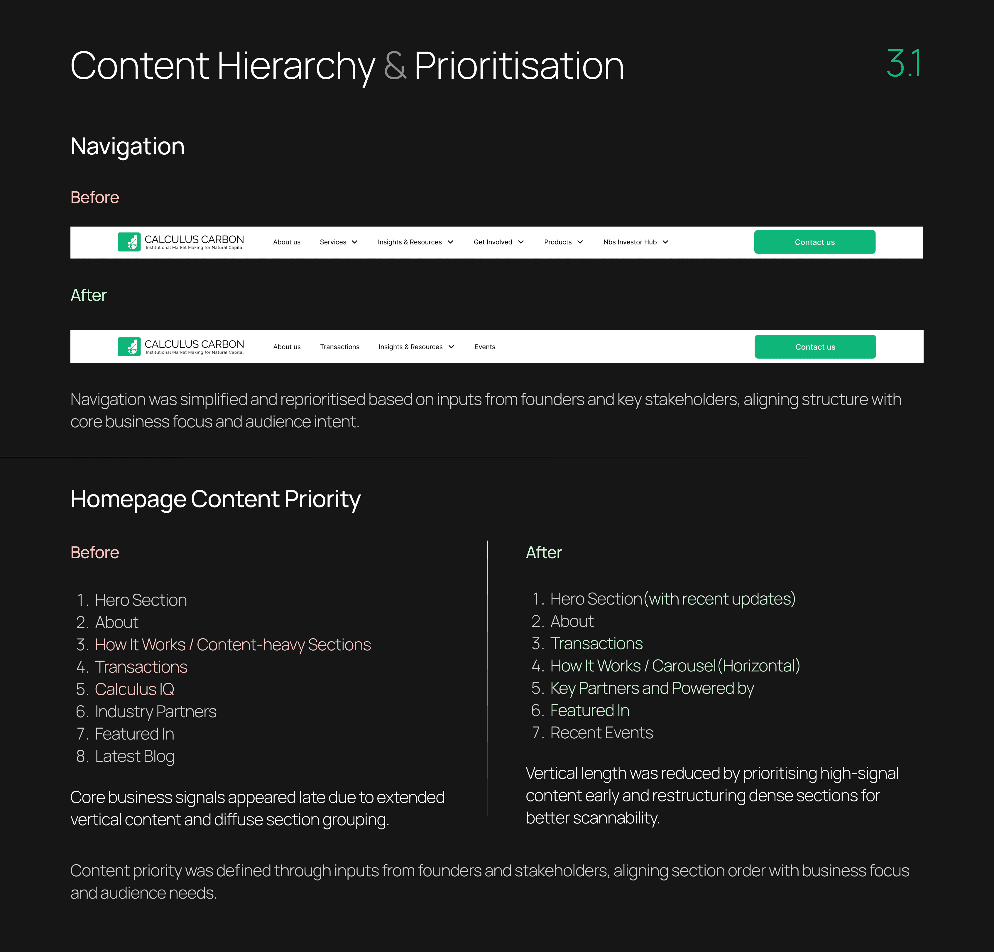
The information architecture was streamlined to prioritise core business content and institutional user needs. Low-signal sections were removed, and navigation and content groupings were reorganised on a hierarchical, intent-driven basis to improve clarity and discoverability.
Hierarchy & Prioritisation
Content hierarchy was refined to align with what institutional audiences look for first—transactions, recent activity, and credibility signals. High-priority content was surfaced earlier, reducing vertical density and improving scannability.
New Sections & Components
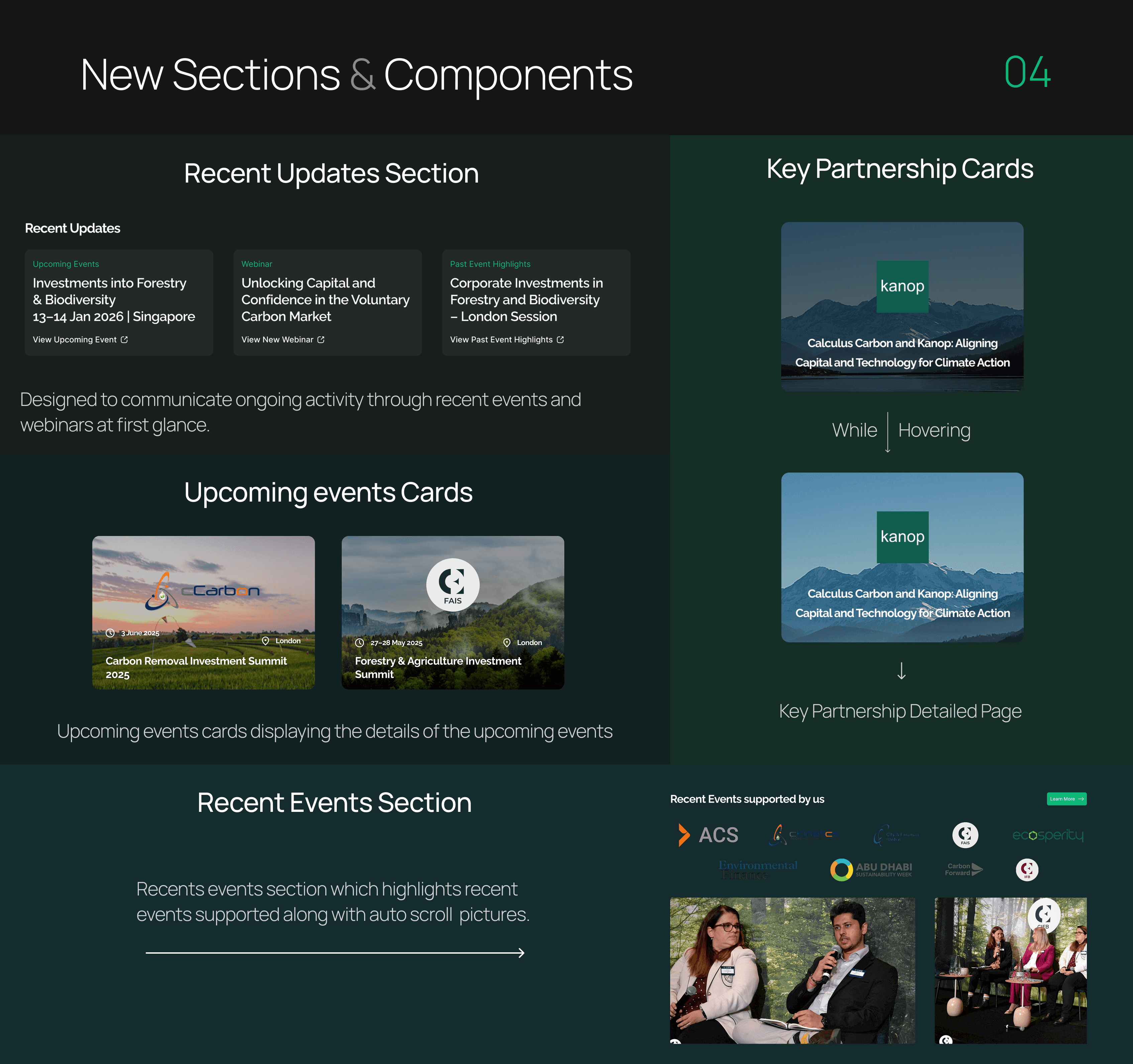
New sections were added to highlight recent updates, upcoming events, and key partnerships through card-based layouts and simple interactions, making ongoing activity visible at a glance.
Redesigned Sections & Components
Existing sections were redesigned to improve clarity, consistency, and content comprehension. Card layouts, hover interactions, and structured content were used to surface key details quickly, reduce visual noise, and support faster understanding across transactions, events, and webinars.

Outcomes & Impact
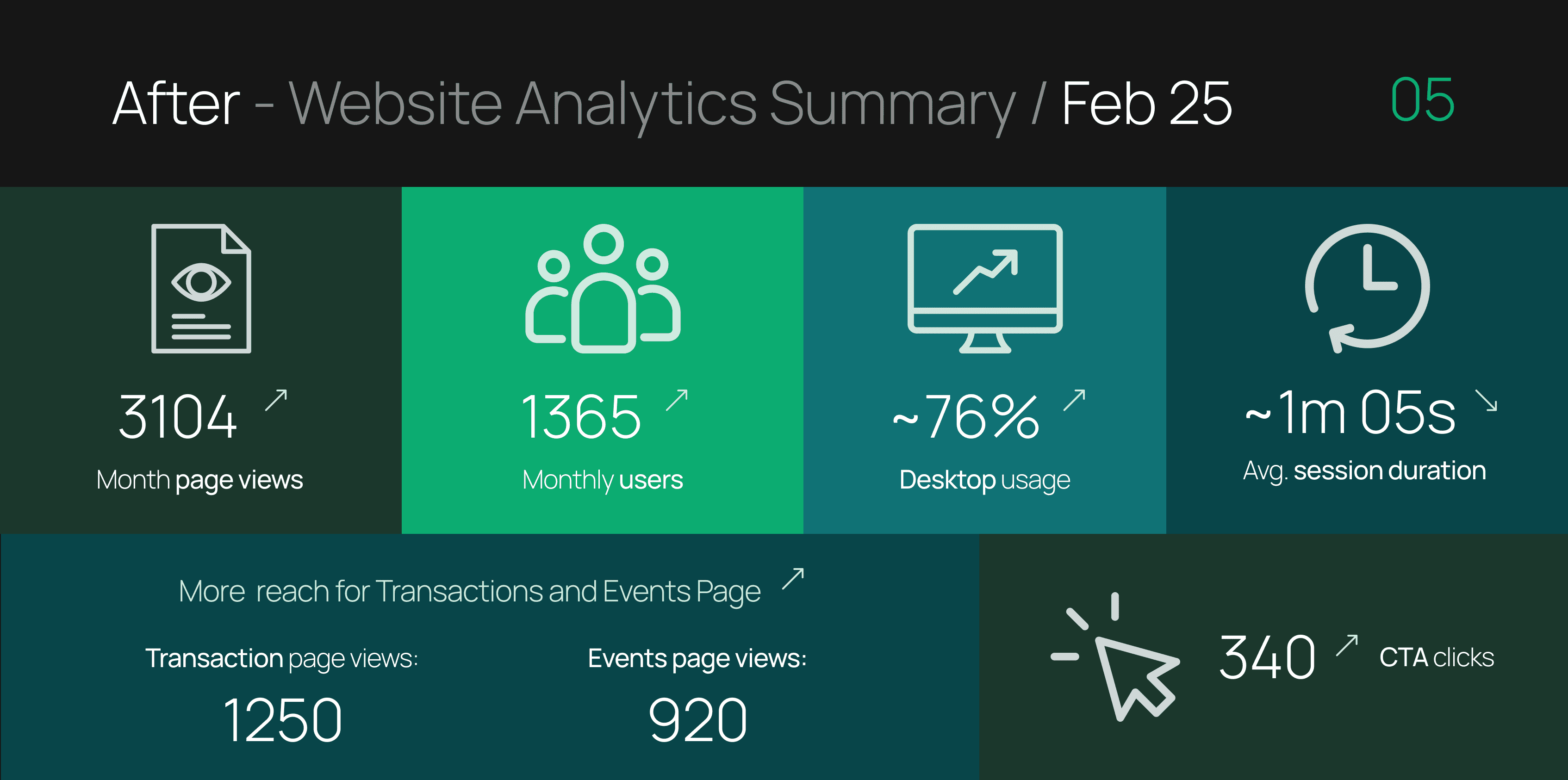
Engagement increased across Transactions and Events, with faster scanning and improved CTA interaction. Usability testing with stakeholders refined navigation and terminology for clearer comprehension.
see also